The design and layout of the checkout page is a key element of the user experience on the website. Even if your online store is generally perfect, an inconvenient or unattractive checkout page can scare away customers. At this stage, customers may change their minds and abandon their purchase or service.
Cart abandonment is a problem for any online business, and increasing the conversion rate requires constant effort. To achieve this goal, the checkout process should be as convenient, simple, and reliable as possible.
Cart abandonment is a problem for any online business, and increasing the conversion rate requires constant effort. To achieve this goal, the checkout process should be as convenient, simple, and reliable as possible.
Let's consider a few basic rules for checkout page design that can help you:
1) The checkout page and the online store should have a visually unified design. A consistent style on the site gives the customer a sense of reliability, as they perceive the purchase process as consistent and well-thought-out. When the design of the site and the checkout page match, the customer feels they are in a familiar and safe environment, which encourages them to complete the purchase.

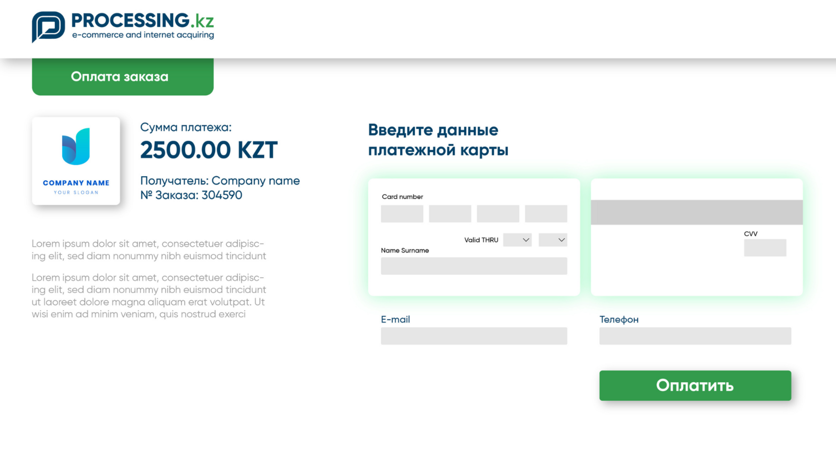
*Sample payment page with required fields
2) The payment form should not contain additional elements such as advertisements, calls to action, or other distracting factors. A simple and uncluttered payment form is more convenient for your customers, reduces cart abandonment, and increases the conversion rate.
3) Required fields must be clearly marked. It is important that user data, such as card number, expiration date, CVV code, and payment amount, are clearly indicated and easily accessible for input. The transparency and clarity of these fields increase the customer's confidence in the correctness of the entered data and reduce the risk of errors.
4) The checkout page should be adapted for customers from different regions or cities. For example, it should provide the ability to use a localized language, offer a variety of payment methods, including those popular in the area, and support payment in various currencies. This improves their user experience and increases conversion by eliminating barriers related to language and currency differences.
5) Security plays a key role. To emphasize this aspect, it is recommended to place payment system logos, PCI DSS certificates, as well as Visa Secure and Mastercard ID Check symbols prominently on the checkout page. It is also important to ensure the visibility of the privacy policy so that customers feel protected and confident in the security of their payment data.
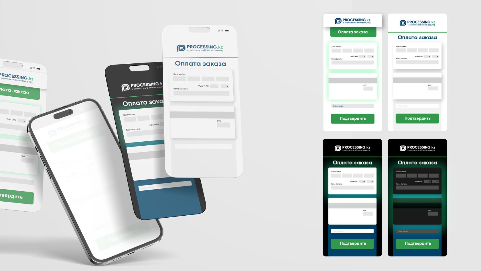
6) The payment page should be adaptive for use on various devices and screens. This ensures convenience for customers, allowing them to complete purchases from any device, be it a computer, tablet, or smartphone. Adaptive design of the payment page improves the user experience and helps reduce purchase abandonment due to inconvenience when using a particular device.

*Sample payment page on a mobile phone
7) Customers should find it easy and intuitive to navigate to the checkout page and back. This enhances the user experience by making the purchase process more transparent and efficient. Simple and intuitive navigation helps customers quickly find the necessary products, add them to the cart, and complete the purchase without unnecessary difficulties.
To learn more about integrating the checkout page and simple, fast, and secure payments, contact the experts at Processing.kz! We are always happy to help find the best solution for your business.
To do this, leave a request for a consultation from our experts using the contact details provided on the website.